BUSINESS INSIGHT: Silent signals -The hidden messages in your logo
Typography influences trust in design. Explore how typography shapes trust, from fonts to spacing, and why magenta is the least trusted color

LogoDek’s Silent Signals survey reveals how design choices impact trust, value, and quality.
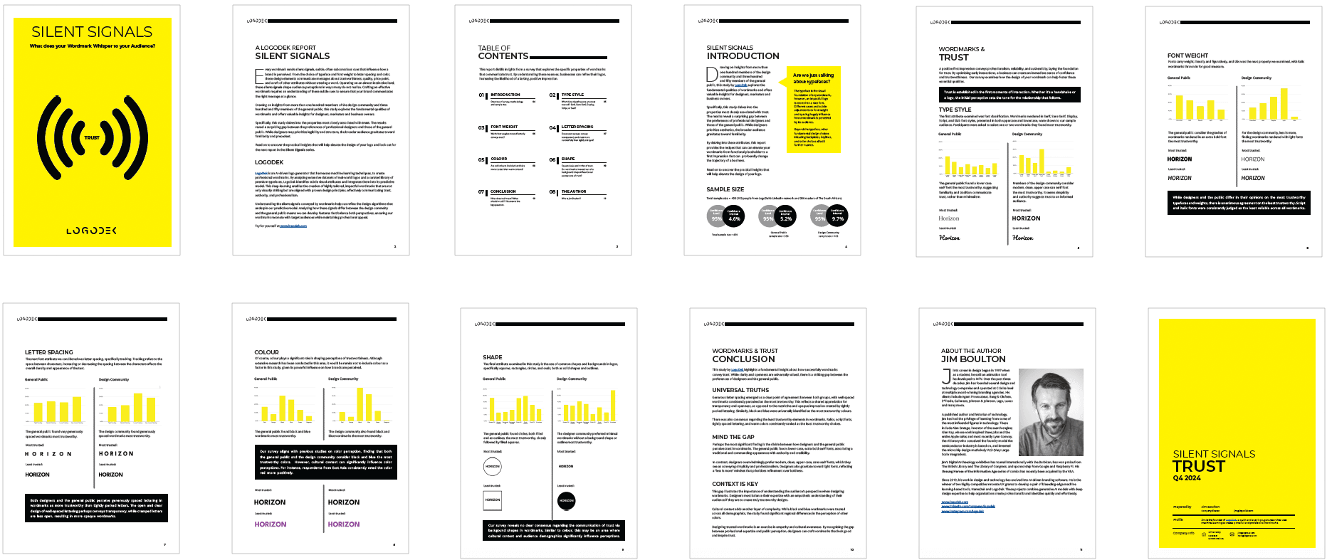
Our first report in the series explores how typography can dramatically shape trust, revealing a surprising gap between the preferences of professional designers and those of the general public.
Thumbnails

Key Findings
The general public trusts lowercase serif fonts, associating their traditional appearance with authority and credibility.
BUSINESS INSIGHTS: Finger Lickin’ good logos
Silent Signals reveals how typography shapes trust in design.
The design community favours modern, clean, uppercase sans-serif fonts, seeing them as conveying simplicity and professionalism.
The general public considers the gravitas of wordmarks rendered in an extra bold font the most trustworthy.
For the design community, less is more, perceiving wordmarks rendered with lighter fonts as the most trustworthy.
Generous letter spacing, perhaps suggesting transparency, is perceived as more trustworthy by both the design community and the public.
Magenta was identified as the least trustworthy colour for a wordmark.

